She's too sexy
Remember that one day… when we were working on the video brochure for CaptureNet?
As the CaptureNet team prepared to launch their new product to the marketplace, we worked to develop a strategic overall campaign and toolkit of brand assets to give them a solid foundation to leap from. The video brochure was just one of many elements in the toolkit, and frankly, should have been a piece of cake.
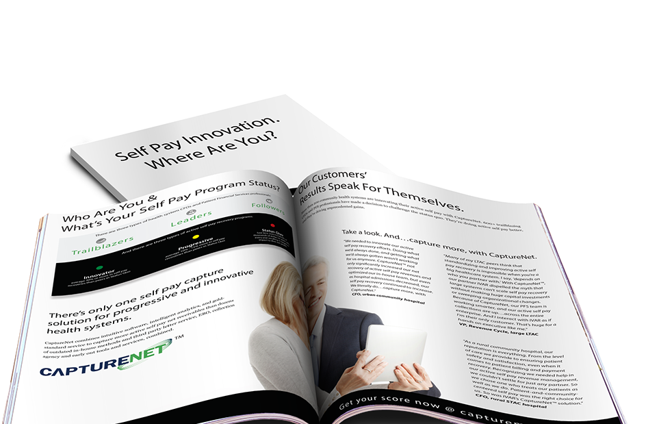
As you can guess, there are always some fun creative challenges you face when really honing in on the target demographic for a particular product – and one of those is often selecting appropriate artwork. In working to select just the right photos of models for the brochure, the creative team had the rest of the office in tears (from laughter) as the review of the photography options sounded something like this:
“She’s too young.”
“No, just no. I don’t know why. But, no.”
“He’s not looking at the camera the right way.”
“Ehhhh.”
“They don’t look professional enough.”
“They aren’t even using technology!!!”
“She’s too sexy.”
Wait…WHAT?! She's too sexy?! She’s about 3 decades into her career, and is just sitting there looking at a tablet. She’s wearing reading glasses and a gray pantsuit! THAT’S too sexy?!
Yes…this is what the conversation devolved into after what felt like years of searching for the right photos. In the end, the video brochure was completed (along with all the other brand tools), and an amazing product went out to market.
Scroll down to check out some of the brand assets for CaptureNet! (And don’t worry – she’s not too sexy).

Ron Robinett
CEO & Creative Director




Brand foundation design and aesthetic developed around innovative product launch

New website with integrated
assessment experience


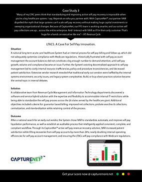

Case studies
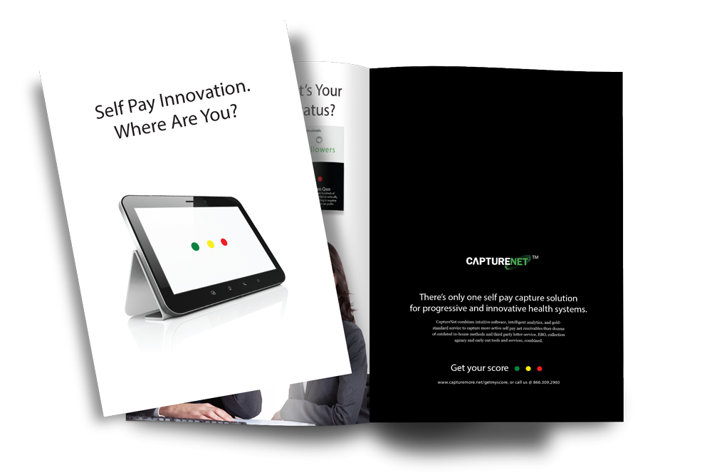
Video brochure
Corporate brochure
Join Our Mailing List
Aw, yeah! Go ahead…just do it! We promise we won’t fill your inbox; just a couple of emails here and there with cool stuff…because that’s how we roll.
X


